The product
A platform that lets non-technical people build automated workflows by talking to an AI.
If that sounds like Make.com or n8n, it isn't — those tools require you to drag boxes around a canvas, connect nodes, configure triggers, debug API calls. They're powerful and they're also incomprehensible to anyone who isn't already a developer.
Our pitch was simpler. You describe the workflow you want in plain English to an AI orchestrator — "every time a new candidate applies to our HR portal, screen their resume against the role requirements, score them, and create a Slack thread for the hiring manager with the top three." The orchestrator decomposes that into a chain of AI agents, configures each one, connects them, and runs the workflow on your behalf.
The user never sees the wiring. They just describe what they want and watch it happen.
This was being built as an internal product first — something our consultancy would offer as a service, white-labeled for each client based on their roles and use cases. The target user wasn't the engineer. It was the HR person, the operations manager, the marketing coordinator. The kind of person who has fifteen repetitive tasks a week and zero ability to automate them themselves.
When this was
Early 2025. AI was still new enough that most people used it for copywriting and one-off questions — assistant work, not deep work. The idea that you could chain AI agents together to do real multi-step processing was still future-tense for most clients.
I'd been using AI seriously since the launch. My girlfriend showed me ChatGPT the week it came out and I understood immediately that the rules of design work were about to change. I'd been pushing the limits in my own workflow ever since. This project was the first time I got to design for AI users instead of just being one.
The org problem
Before the design problem, the organizational problem. The project had no single decision-maker for most of its life.
We — the other designer and I — built mockups for weeks. Sixty, seventy percent of the screens done. The BSA, the sales team, and various stakeholders all had opinions. None of them had final say. We were designing for a moving target by committee, which is to say we were designing for nobody.
Then, late in the process, a decision-maker appeared. Real authority, real opinions, real overrides. Some of the work survived. Some didn't. Some of it got redesigned for reasons that had less to do with usability and more to do with the new person's preferences and the sales team's pressure to ship something fast.
I won't pretend this was easy. From the design side we were trying to build the most useful, meaningful experience for users we'd actually interviewed. From the BSA and sales side, the priority was an MVP fast enough to start collecting money. I don't blame anyone for those priorities — they're real business priorities — but without a referee, every meeting became a debate about direction, and direction-debates eat momentum.
I learned a lot here about working without a clear hierarchy. About when to push and when to let go. About how to keep a team's design integrity intact when the org around it can't decide what it wants. That's not a skill they teach in design school. It's the skill that separates senior designers from everyone else.
The hard problem: representing the workflow
The orchestrator generates workflows. Workflows are chains of agents. Agents do things. The question that ate most of our design time: how do you show the user what's happening?
The naive answer was a list of process steps — "step 1: parse resume, step 2: extract skills, step 3: score against role" — and we tried that first. It collapsed almost immediately. A developer might read a process list and feel oriented; an HR coordinator reads a process list and feels like they've been handed a stack trace.
The next attempt — pushed by the development team — was Kanban. Each agent gets a card. Cards move through columns: queued, running, completed, failed. The whole workflow expressed as a project board.
We pushed back. Hard.
Here's why: real workflows in this system aren't linear. They have parallel branches — three agents working at once, each doing a different subtask, results merging back. They have loops — agents calling other agents, sometimes calling themselves. They have backflow — an agent realizing it needs more context and going back to a previous step. None of this fits the Kanban metaphor. Kanban is for sequential, human-paced work.
And the timing made Kanban actively bad. Agents complete in seconds, sometimes fractions of a second. With Kanban, you'd see cards flickering between columns multiple times per second. Cards appearing and disappearing as agents spun up and finished. A board that's supposed to communicate calm progress would instead look like a slot machine.
The canvas
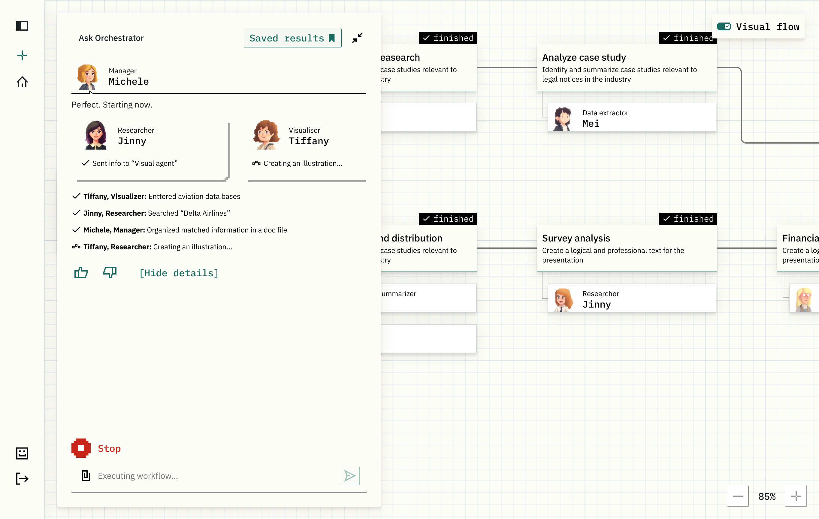
So we went the other direction. A canvas. A diagram. Each agent gets a cell positioned spatially. Connections between agents are drawn as lines, showing what depends on what, what runs in parallel, what loops back. Color coding for state — idle, working, completed, errored. Notification popups bloom over agents as they emit status updates and quietly fade out. The whole flow becomes a living organism on a board.
The reaction was immediate. Users got it. The canvas made parallel work legible — you could see three agents running simultaneously because they were drawn side by side. You could see the loops because the lines curved back. You could glance at the board and understand what the system was doing without reading any text.
The unexpected outcome: people found it fun. Not in the slot-machine way crypto products are fun. In the watching-an-ant-colony way — emergent, complex, comprehensible. They'd open the canvas just to watch their workflows run. We hadn't designed for that, but we'd gamified the experience by accident, and it became one of the product's strongest hooks.
The smaller research finding: don't make AI look human
Early in the project we tried representing the AI orchestrator as a human-like avatar — soft features, friendly persona, conversational. The thinking was that humanizing AI would build trust and break down the user's hesitation to ask it real questions.
Users hated it.
The feedback was consistent: making AI look human made them less willing to trust it. Either because it felt uncanny, or because they didn't want AI pretending to be something it wasn't. They preferred AI that looked like AI.
So we pivoted hard. The orchestrator became pixelated — deliberately, intentionally robotic, a small abstract shape that read as "computer" rather than "almost-person." The whole product's aesthetic centered on this. Pixel art, slightly retro, a visual register that said this is software, it's clever software, but it's not pretending to be your friend.
That research finding turned into the product's identity. And in retrospect, it's the same instinct as Glazd, just inverted — both products use deliberate visual coding to signal what they are and what they aren't. People reward you for being honest about it.
Templates and the limits of imagination
One of the smaller things we built: a library of pre-made workflow templates. Common patterns for each role and department — HR onboarding flows, marketing campaign automations, ops alert routing.
The reason wasn't laziness on the user's part. It was that most people, even now, don't know what AI can actually do. They underestimate it constantly. Even with Claude available today, most people use it like a search engine instead of a workflow engine. Most don't realize they can just ask whether something is possible — that the asking is the cheapest part. The cap on what people get out of AI right now is mostly imagination, not capability.
Templates lowered the imagination tax. You scrolled the library, saw "huh, I didn't know you could do that," and the ceiling moved a little higher in the user's head. Half of what the templates accomplished was making the user braver.
What this case actually is
Not a triumph story. The org made it harder than it needed to be. The decision-maker showed up late. Some of the best work got compromised. That's true.
But the design wins were real. The Kanban-vs-Canvas argument we won. The "don't make AI look human" research finding we acted on. The template library that quietly raised users' imaginations. The fact that the team I'd just joined saw, by the end, that I could do more than tables and airports.
That last part mattered most for my career. The work I did here was the work that got me promoted out of regular designer into product ownership a year+ later. Not because the project alone earned it, but because the project showed who I was when given something real to work on.
The product shipped. It's in market. AI orchestration is now a category — there are five or ten competitors doing variations of this same idea — and looking at what they shipped, our take on the canvas problem holds up. We got that one right.